The problem with the blank box
Most people meeting an AI tool for the first time meet an empty text field and a cursor. If you already know how to write a prompt that's freedom. If you don't, it's a blank page with nothing to react to, and most people close the tab.
The product
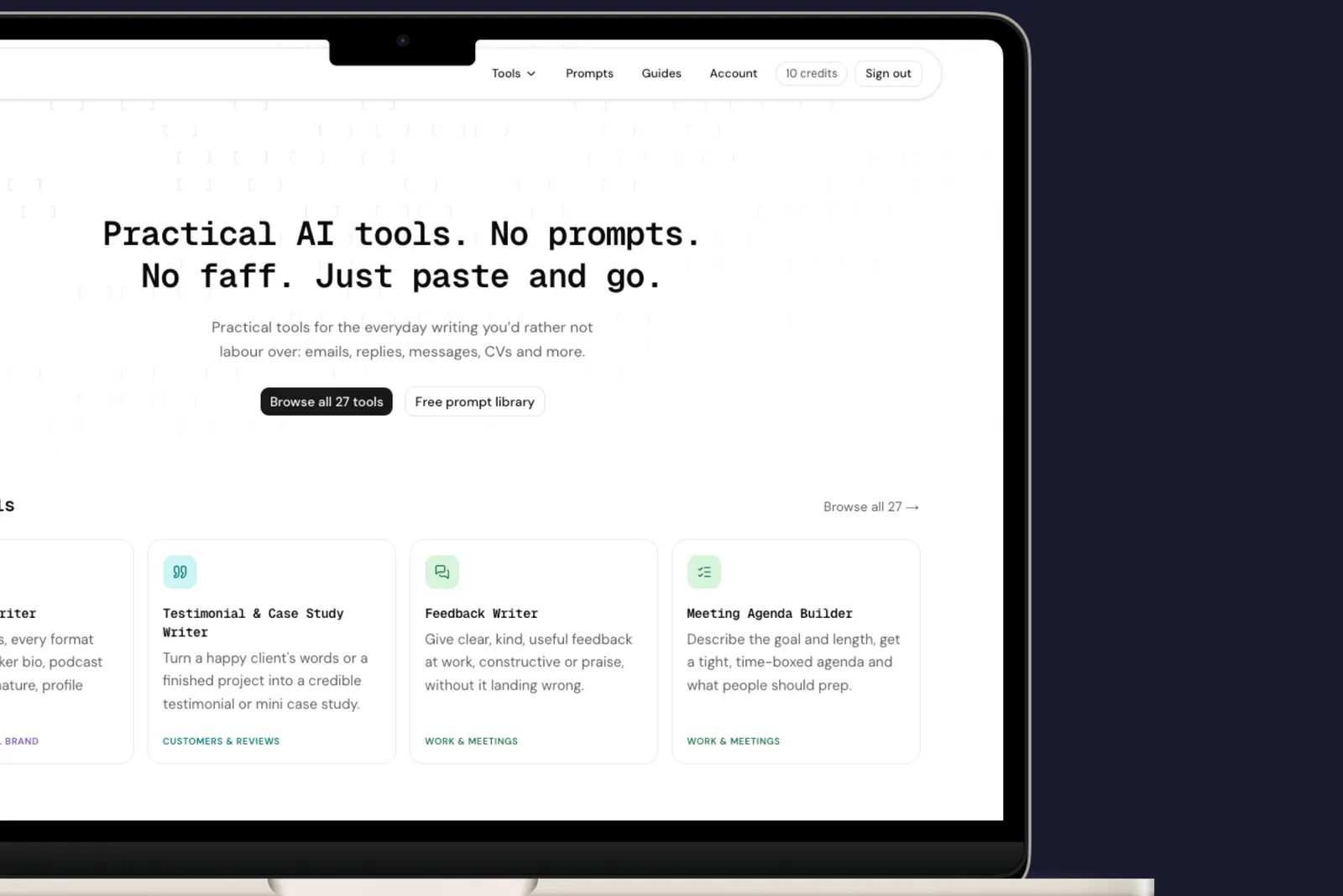
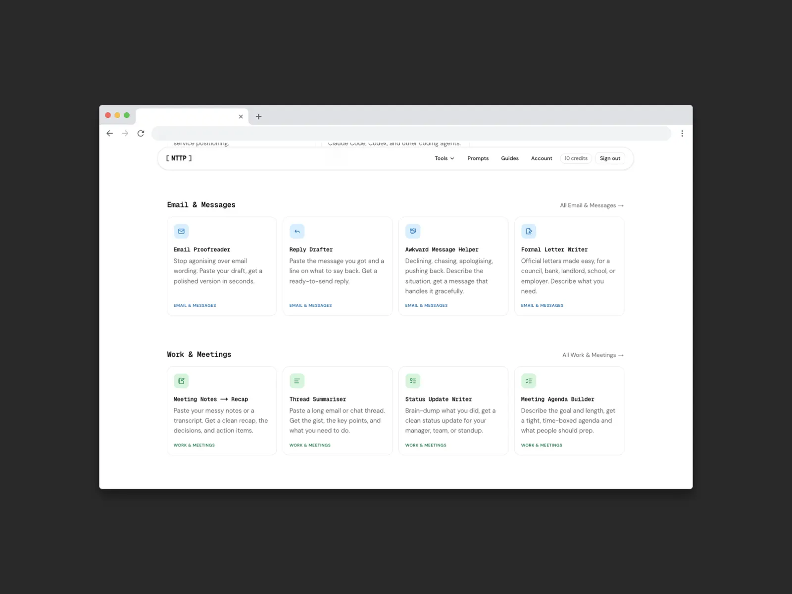
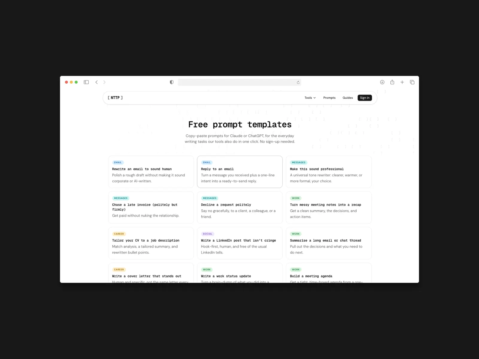
No Time To Prompt turns that around. You pick the task, paste your content, and get a usable result without writing a prompt at all. The prompting is the part I did in advance; what's left for the user is choosing and pasting.
What it was really for
Part product, part sandbox. Building it was the fastest way to find out how people who aren't fluent in AI actually behave when you put it in front of them, and that's directly useful when a client asks for AI in their own product.
Designed, built, shipped and monetised alone, on Next.js, Supabase and Vercel with payments through Polar.
Performance
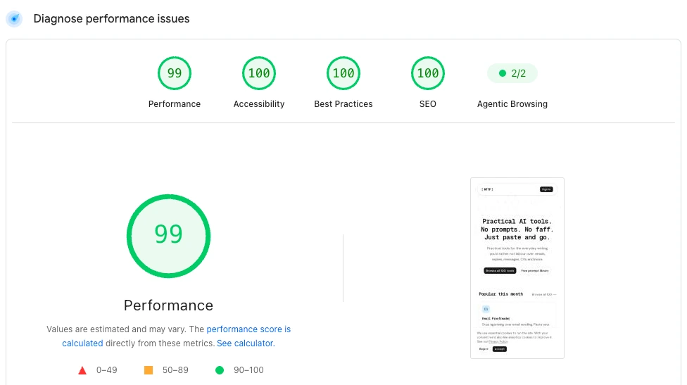
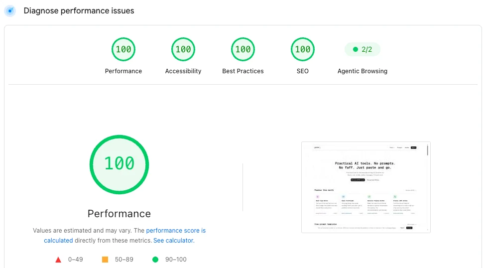
Mobile is the harder test and the one most people arrive on, so it's worth showing alongside the desktop result instead of replacing it.
Desktop
Mobile